Brief
One of the main challenges lies in the inevitable need to unify and reformulate the current corporate identity of the Tatra Trucks brand, which has become fragmented and insufficiently consistent over time. This problem arose from the way various elements were implemented into the corporate identity over the course of ten years, often haphazardly and without a clear concept. These elements include various aspects from product campaigns, graphic elements for different product lines (such as Defence, Firefighters, Civil), and presentations of new corporate values or slogans.
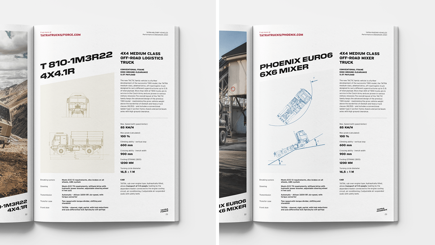
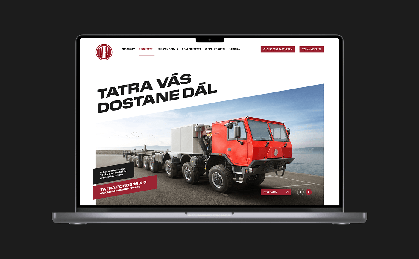
The goal is to create a new design manual that provides a clear and consistent framework for the corporate identity of the Tatra Trucks brand. This manual should contain precise specifications regarding corporate values, slogan, and branding of product lines (specifically Tatra Phoenix and Tatra Force). Additionally, it should include examples and instructions for applying these elements to various materials, including corporate stationery and presentations. Furthermore, possibilities such as changing the font and adjusting the logo for digital applications should also be explored.


Redesign
In our approach to addressing this task, we focused on comprehensively unifying the corporate identity of the Tatra Trucks brand through the creation of a new design manual. We have selected the Pilat font and inclination, symbolizing courage and the capability of our Tatra vehicles to conquer challenging terrains. Subsequently, this chosen font and symbol have been applied across all layouts of corporate materials to uniformly reflect the characteristics of our brand and strengthen its identity.